Tucan Travel Fold-Out Destination Guides
Tucan Travel
Travel Guide
Editorial Design
Objective
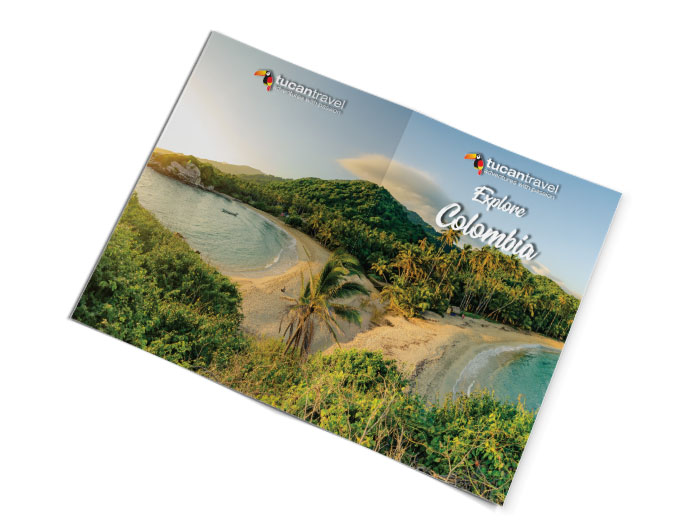
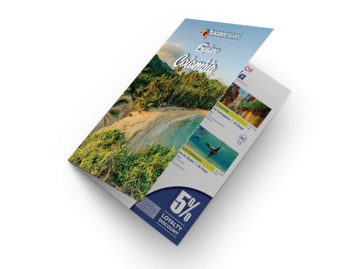
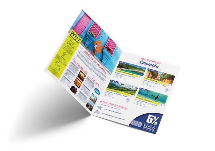
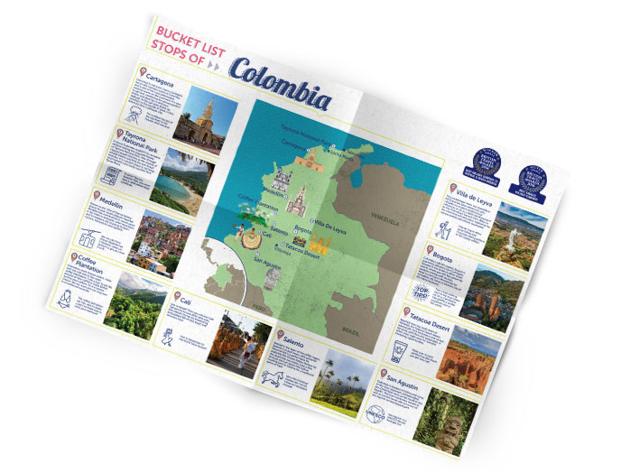
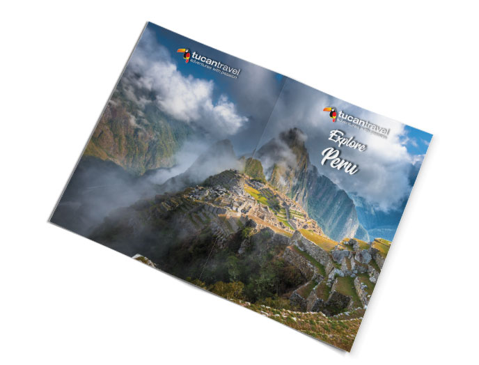
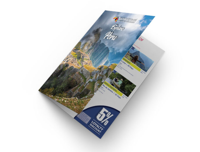
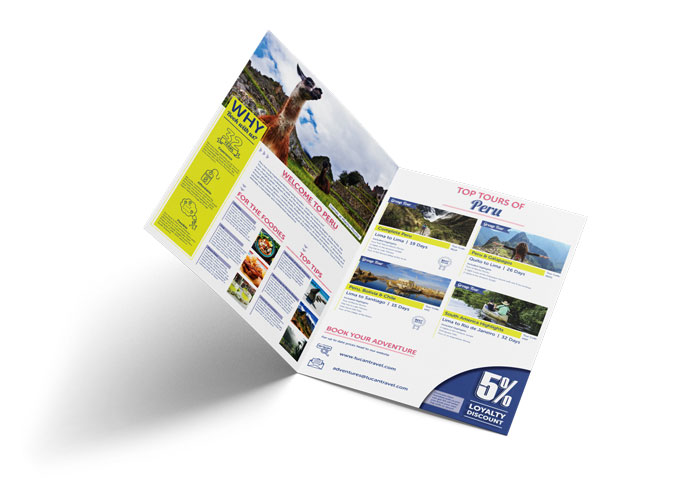
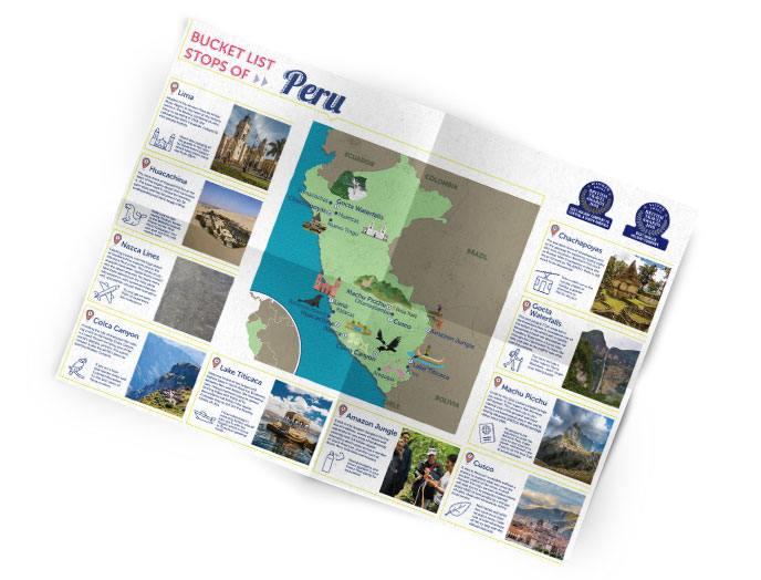
Tucan Travel wanted a brochure series for three of its most popular destinations: Peru, Sri Lanka and Colombia. The idea was something people would actually want to keep. Folded, it works like a normal brochure, with tours, tips and booking info. Lift the bottom and it opens into a full A2 illustrated map of the country, with ten bucket-list stops worth hanging on a wall.
I’d travelled to Peru and Sri Lanka with Tucan on educational trips, so for those two I was designing from first-hand experience. That made a real difference to what I chose to show and how I told each country’s story.
Project Goals
The brochures needed to:
-
Inspire people to explore each destination through its best experiences
-
Double as a poster, so the brand stayed on someone’s wall long after the trip was booked
-
Present tours, loyalty discounts and booking details clearly
-
Keep one consistent system across all three countries, while letting each one feel distinct
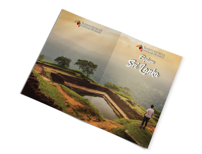
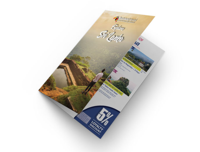
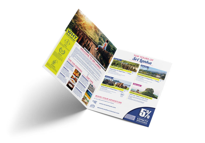
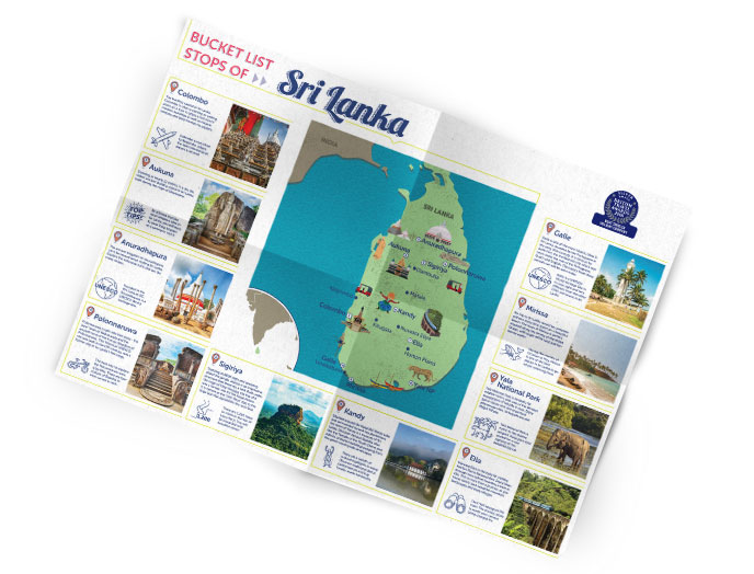


How It Unfolds
Folded, each brochure works like a normal travel guide. The first fold opens to tours, foodie highlights, top tips and booking details. Lift the bottom and it opens out into a full A2 illustrated map of the country, with ten bucket-list stops, each one pinned, photographed and described. It’s made to be read, then kept.
General Linear Icons
These icons were created for common use through each of the country-specific foldouts within the first opening fold. So the icons within the yellow rectangle would be used to represent the companies USP's (unique selling proposition) which would sit above the copy, describing what makes the company stand out from the crowd. The other icons further below were used for communication symbols and also labelling the best selling tours.


