
EdTech Product Demo
Immersify
Demo Video
Motion Design/Creative Direction
Objective
Immersify had shifted its focus to higher education: universities, dental schools and healthcare faculties. The people watching were no longer students. They were department heads, procurement leads and academic decision makers at some of the world’s biggest healthcare conferences.
The old demo no longer fitted. A new one was needed that could run on an exhibition stand, open a pitch and explain a complex platform in under three minutes. The planning, direction and execution were all mine.
Project Goals
Immersify does a lot. The risk was a video that showed everything and said nothing. It needed to:
-
Explain what Immersify does in the first five seconds, before anyone walks past the stand
-
Follow how a buyer judges a platform: who it is, what it does, why it works
-
Work with or without sound, as a looping stand display or a voiced pitch opener
-
Leave decision makers clear on the platform and wanting a conversation


The Audience
Every decision came back to one question: who’s in the room?
At ADA, ADEA, IDS, ASPiH and ASDA, the viewers were lecturers, faculty leads and procurement teams. These were people with budgets and very little patience for a product that can’t explain itself.
So the opening answers “what is this?” straight away. From there the video moves from identity, to value, to features, to proof. The testimonials bridge the gap between “this looks impressive” and “this works in a university like mine.
The Approach
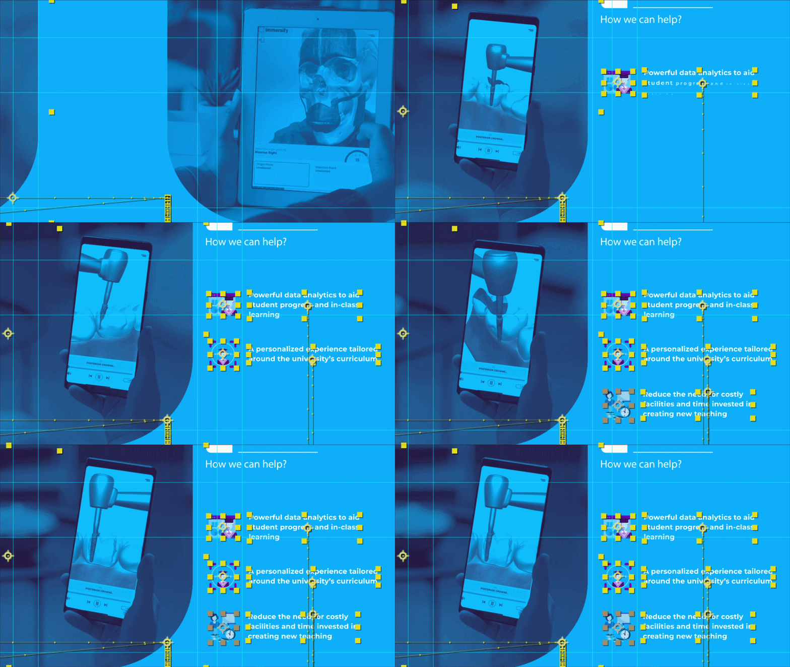
I wanted a visual language, not just a run of scenes. The Immersify logo is three overlapping rounded squares, so that shape drives every transition. Rounded frames carry footage between scenes, each section slides in with the same tab and line, and the palette moves between deep purple and electric blue. Nothing is random.
Animation was built in After Effects and edited in Premiere Pro. The trickiest part was making the tech feel real. I tracked platform recordings onto phones and tablets in stock footage, and timed my own taps and swipes to match the hands on screen. Playful moments, like the 3D muscle selections and AR interactions, were timed to sit inside the sales story rather than distract from it.

This video wasn't just
about the features
it was about
the experience
Final sales demo — shown at dental and healthcare conferences worldwide
Creative Reflection
Motion design isn’t just about making things move. It’s about planning the illusion of simplicity.
I started with a long script and a folder of dry screen recordings. My job wasn’t to edit them together. It was to make clients see more than software, to see something students would actually enjoy using.
My favourite moment is the bridge between the CMS and the student. A lecturer builds a lesson around a 3D model, then it cuts straight to a student using that exact model on their phone. One cut that sums up the whole platform.
If I did it again, I’d push for one testimonial instead of three. Three took the video past three minutes, and on a busy stand shorter always wins.
The video is still being shown at conferences around the world today. It was never about a flashy demo. It was about a story that lands with the people deciding the future of healthcare education.
