

© 2035 by The Clinic. Powered and secured by Wix

Flipped Classroom Web Ad's
Immersify
Animated B2B Web Advertisement
Motion Design & Visual Strategy
The Brief & Strategic Initiative
The initial request was broad: create web advertisements to drive traffic to the Immersify app and company website.
However, in my role as Lead Motion Designer and Visual Strategist, I took the initiative to analyze the business model and target audience to determine the most effective path for ROI. I identified that while individual app downloads (B2C) provided value, the highest Return on Investment would come from B2B Institutional Adoption, getting schools and universities to integrate Immersify into their curriculum.
The Solution
Rather than creating generic "Download Now" ads, I utilized my position to shape the campaign strategy. I focused on Solving Educational Problems to target Deans and Academics. By addressing their pain points (Engagement and Retention) with data-backed visuals, I positioned Immersify not just as an app, but as an essential institutional resource for "Education 2.0."

Project Goals
Drive Awareness
& Traffic
Capture high-intent organic traffic by targeting key search terms such as "Flipped Classroom," positioning Immersify in the EdTech space to boost overall online presence.
Tell the Story &
Visualize the Solution
Bridge the gap between abstract technology and user understanding by demonstrating exactly what Immersify does in contrasting traditional lecture instruction with interactive 3D and AR simulations.
Validate the Product & Provide Evidence
Appeal directly to institutional needs by designing realistic mock-ups of analytics dashboards. Provide a tangible solution to industry-wide problems by visually proving improvements in student retention and engagement.
Convert Leads &
Spark Conversation
Create compelling content that serves as a talking point for educators and peers discussing the future of healthcare education, ultimately driving them to "Book a Demo."

Visual Narrative & Storyboarding
To visualize the transition from "Education 1.0" to "Education 2.0," I developed a motion design strategy that integrated retro classroom aesthetics directly into the narrative flow to contrast passive learning with interactive EdTech solutions.
Ad 1: Engagement (Graph Paper Theme)
-
The Rejection: I established a traditional lecture theme with use of graph paper textures, and a black-and-white lecturer cut-out. The typeface to animate as if written in a typewriter effect, using an old-style serif typeface (Palatino) with highlighted accents. The visual is then scrunched up and tossed away via animation, symbolizing the move away from passive study.
-
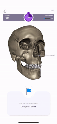
The Evolution: A 2D sketch of head and neck anatomy that seamlessly morphs into a 3D model asset, visualizing the shift to modern learning and demonstrating modern integration.
Ad 2: Retention (Blackboard Theme)
-
Out with the Old: This ad campaign utilizes a spinning blackboard axis to create a continuous progression. Typography is revealed via trim paths to mimic the handwriting of a lecturer, with key phrases underlined in a traditional teacher's style to establish the conventional setting.
-
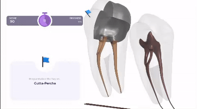
In with the New: Aligning closely with the "Flipped Classroom" model, the rotation stops halfway to reveal a 3D dental amalgam perfectly aligned with the original chalk illustration outline. This bridges the gap between theory and practice, positioning the platform as a leader in healthcare education.


Design Solving Platform Constraints
Since the "Spotter" gameplay and Analytics features were currently exclusive to the mobile app, with a desktop version scheduled for a later development stage, I took the initiative to bridge this gap for the campaign. I captured screenshots of the mobile build and prototyped entirely new desktop UI layouts directly in After Effects.
-
Gameplay UI: I adapted the app’s mobile "Spotter" game into a desktop format. By scaling the UI elements to fit a larger screen while maintaining the original design language, I was able to effectively demonstrate the interactive learning experience on the platform where institutional clients are most likely to view it.
-
Analytics Dashboard: I designed a realistic desktop analytics portal from scratch. Utilizing the increased screen real estate, I added new data fields and evidence-based metrics. This allowed me to visually back up the theory that tech-based learning is essential for building student retention, adding depth to the campaign's value proposition.
The Engagement Evolution
Visualizing the shift from passive to active learning using a tactile 'scrunched paper' metaphor. Enhanced with AI voiceover narration, this ad contrasts traditional aesthetics with a seamless 2D-to-3D anatomy reveal.
The Retention Shift
Utilizing a rotating blackboard to symbolize the Flipped Classroom transition. I combined this visual metaphor with custom desktop UI prototyping to demonstrate how interactive data improves retention.
Final Campaign Delivery
CREATIVE REFLECTION
This project was a joy because it required deep research into the "why" before the "how." I delved into the problems facing modern education, specifically student retention and engagement, and I wanted to create an answer. The ads aren't just commercials; they are proof that the company offers a real solution to these academic struggles.
To make that answer resonate, I leaned into nostalgia and texture. By using graph paper, chalk dust, and the sound of a classroom bell, I tried to trigger a shared memory of what learning used to feel like, before contrasting it with the sleek, immersive reality of Immersify. It wasn't just about making a cool 3D model; it was about visualizing the bridge between passive listening and active understanding.
In the end, these ads aren't just marketing materials. They are a visual argument for the future of education — a way to show educators that we understand their challenges, and that the solution is within reach.
