

© 2035 by The Clinic. Powered and secured by Wix

The Modern Dental Student 2025
Immersify
White Paper
Editorial Design
Objective
The Modern Dental Student 2025 white paper was created to communicate the real-world challenges, motivations, and learning preferences of today’s dental students. The goal was to highlight key insights from a national survey and influence academic stakeholders to reflect on their institutional support structures.
As the lead designer, my role was to translate a dense, research-heavy manuscript into a clear, engaging, and visually compelling editorial document. The objective was to improve the accessibility of the findings, create visual hierarchy for easier reading, and help position Immersify as a forward-thinking, student-centric education platform.
Project Goals
The final report was expected to:
-
Present complex data and key messages in a highly readable format.
-
Visually amplify the students’ voices and survey findings.
-
Encourage lecturers, institutions, and decision-makers to take action, including contacting the sales team for a demo or integration opportunity with Immersify’s platform.


The Approach
This white paper wasn’t just designed to inform, it was designed to connect. By interpreting survey data through illustration, layout, and visual storytelling, this project turned raw research into an accessible, meaningful experience for academics, institutions, and students alike.
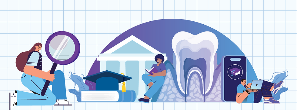
Visualizing Student Voices
To ensure the white paper didn’t just report findings, but actually amplified them, I created a visual language rooted in the student experience. Each visual element was designed to translate raw data and written insight into something clear, emotional, and accessible.
-
Tailored Illustrations: These captured the sentiment behind student feedback from stress points and clinical challenges to aspirations for modern learning.
-
Infographics: Built from the ground up to make complex data intuitive, revealing patterns and contrasts that support institutional reflection.
-
Minimalist Stock Imagery: Used selectively to add human context and reinforce tone, without overwhelming the content.
The layout followed a clean modular grid, anchored by strategic whitespace, consistent typography, and Immersify’s branded color palette all working together to deliver a cohesive, engaging reading experience.


This white paper wasn't just designed to inform
it was designed
to connect
Creative Reflection
This project really reminded me that design isn’t just about making things look good, it’s about making things feel something too.
I was handed a pretty dense, text-heavy document packed with student feedback and institutional data, and I knew early on that my job wasn’t just to make it more readable. It was about helping people actually connect with what the students were saying. Not just see the stats, but feel the message behind them.
That meant leaning into empathy. I used illustration, layout, and visual tone to help bring out the voices behind the data, the stress, the motivation, the things students wanted but didn’t always know how to say directly.
From infographics that make patterns easier to understand to illustrations that reflect what students are experiencing, the goal was to give the content a sense of clarity and warmth. Something human.
In the end, it wasn’t just about building a nice layout. It was about creating a resource that resonates, that speaks for the students, and that invites the reader to really listen.


