© 2035 by The Clinic. Powered and secured by Wix

Crafting an Empowering Nursing Brochure
Immersify
Digital Brochure
Brochure Design
At Immersify, an innovative educational app designed to aid nursing and dental students in their learning journey through augmented reality and interactive gamification, I was tasked with creating an engaging and interactive brochure. This brochure aims to capture the attention of academics and faculty, demonstrating the unique benefits of our product in a fun and captivating way.
Objective:
Immersify is an educational app designed to aid nursing and dental students in their learning journey through augmented reality and interactive gamification.
Project Goals:
-
Capture the attention of academics and faculty.
-
Demonstrate the unique benefits of the Immersify app.
• Promote engagement and adoption of the app in educational institutions.


Initial Concepts
-
Mood Boards and Sketches: Developed mood boards to explore various design ideas and themes that would resonate with the target audience. Created sketches to plan out the layouts and visualize how visual material could support the content and display the features of the app.
-
Layout Planning: Planned the layout through detailed sketches, ensuring that each section of the brochure would effectively highlight the app’s features and benefits.
Visual Language That Speaks Across Platforms
To support and simplify the messaging within the Immersify Nursing brochure, I developed a library of custom-designed icons — each crafted to reflect the platform’s features in a clean, accessible, and brand-aligned way.
These icons not only helped break down complex educational information into digestible visual elements, but also formed a core part of the broader Immersify brand system. From print brochures to promotional campaigns, they ensure continuity, clarity, and a polished visual tone.


To enhance clarity and navigation within the Immersify app, I also designed and animated a set of linear based icons, each representing a different learning resource which is available inside the app. These icons were also integrated into the digital brochure, where they animate sequentially to preview the educational journey.
This approach adds motion-based engagement to static formats, helping students and educators easily identify the type of activity they’re about to engage with.
Designing for Digital Engagement
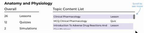
The digital brochure was designed to echo the interactive feel of the Immersify app. To keep things clear and engaging, I used GIFs, animations, and videos to show how features work without relying on heavy text. In the UK version, a scrollable list replaced 28 static pages of content, making navigation much easier. These interactive elements helped educators and students quickly understand the platform — not just by reading, but by experiencing it. Everything was built to mirror the immersive nature of the app, turning the brochure into more than just a guide — a real extension of the product.